 by Usman Sheikh
7 Simple & Easily Adaptable Design Tips For Display Ads
7 Simple & Easily Adaptable Design Tips For Display Ads
Display ads are a significant investment for the business. An ad help consumers get familiar with your brand. Retargeting with a display ad is known to provide high ROI.
With approximately 11% of internet users blocking display ads while others are tuning them out, it means you have to work hard to make your ads get those clicks.
For users to click your display ads, you need compelling copywriting and outstanding visual creativity.
However, not every business leader or marketer who wants to run a display campaign is an expert in designing ads.
Fortunately, we have taken the time to help you know how to take your design game to make your ads more click-worthy.
Distinguishable Structure
If you want to get at a competitive edge, ensure the ad structure is outstanding. The ad must have defined borders and should never be confused with the normal web content.
As you think about the structure, remember sizing should also be right. It would be best to put the ad in different sizes as people use different-sized screens for viewing ads.
Before displaying an ad, ensure it’s the best choice for you. Google offers different ad sizes from leaderboard to half-page ads to huge mobile banners.
The most sort after size is 300 x 250, which is known as the medium rectangle. 336 x 280 is the large rectangle, while 728 x 90 is the leaderboard. 360 x 600 is the half-page format that provides a large space for marketers to message the target audience.
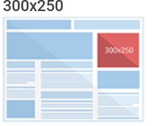
Source: Google Support
The half-page is the fastest-growing size where publishers offer more visually impactful and impressive ad sizes. The large mobile banner (320 x 100) can be used as an alternative to 300 x 250 and 320 x 50.
Ensure you get the right yet flexible structure, not forgetting to pay attention to the best
Apart from choosing the right size, consider other elements that will make the ad distinguishable. This includes:
· Your Logo
A logo is an effective advertising method that is always overlooked. Most companies use logo design to promote public recognition. Logos boost brand identity and brand marketing.

In the above example – a simple question-based display ad targeted to sign up people for our landing page uses both the logo right on top and our website to form those impressions.
Including a logo or company name in your ad campaigns helps in building your brand identity to the general public. The more your logo is displayed, the more identity and trust you’ll build from your target audience.
· Visual Representation
“A picture is worth 1,000 words.”
The phrase is always true!
Any advertising piece has few seconds to grab the attention of the potential customer.
Pictures beat texts and audios. Humans are incredible at remembering pictures. You can only remember 10% of the content you heard after three days. On the other hand, you’ll remember 65% of the content if a picture is included.
Images and other visuals trigger emotions, creating a stable connection with your customers.
If you’re trying to convey the message to your prospects, leads, and current clients, visual content will effectively and efficiently speak to them.
Use attractive images that will grab attention promptly. Ensure you use genuine pictures that are appropriate and resonate well with your audience.
Here is an example of a simple photograph used with the right captions and our logo:

This is another campaign we ran for another event on Marketing Psychology.
Get genuine pictures from reliable websites like Pexels.
· Value Proposition
This is a promise by the company to consumers. It’s an easy-to-comprehend reason why potential and current customers should buy a service or product from your company.
The value proposition explains how the product will benefit, fills a need, and why it’s better than the rest on the market.
A value proposition’s main idea is to appeal to customers, who are the strong decision-making drivers. A successful value proposition has an impressive headline that incorporates catchy slogans. There is usually a subheadline underneath the main headline that explains why the service or product is superior on the market.
A value proposition follows various formats as long as they appear unique to consumers. Value propositions should be easy to understand and illustrates specific results for people using the product or service.
Ensure you avoid corny marketing buzzwords. A value proposition should be communicated within the shortest time possible. Current and potential customers like it short and sweet.
· The CTA Button
The CTA or call-to-action is a simple directive statement that tells prospective customers what to do, how to go about it, and where to go next. It makes the user’s journey clear and simple. The CTA eliminates confusion and allows visitors to take the necessary action.
With CTA, there is no doubt about the intention of the content. The content builds excitements and intrigue and convert the reader to a paying customer.
CTA should be as simple as “call us today for more information” or “Follow us on Instagram.”
So, how do you arrange these elements?
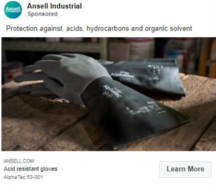
You can see the CTA button clearly labelled for this example of an ad for a glove manufacturing company.
The CTA and value proposition are the most crucial. Thus, they should be visually distinct elements. Place the logo on the sidelines or ensure the image doesn’t block any of the copy.
Colour is Vital
When it comes to ads, color plays an important role. Colors grab customer attention and educe emotions. When marketing and product or service, it’s important to consider that when customers are shopping, they place color and appearance above other factors.
Colour increases recognition that’s directly linked to customer confidence. It’s a non-verbal form of communication. It can enhance understanding, learning, and reading. And since it’s a visual element, it’s understood by the brain faster than a text.
Consumers associate your color theme with your company or brand—for instance, consumers associated Coca-Cola with red.
Color psychology is something you need to understand when designing ads. Men have different color preferences from women. Men can resonate well with blue and green colors.
Red, black, orange, and royal blue connect easily with impulse buyers. Sky blue, pink, and other soft colors are associated with cloth shoppers. Other colors can be a bad fit for consumers.
For instance, gray or brown color for feminine hygiene products is not the right combination. The colors feel wrong, and they don’t match consumer’s expectations. Red is an excellent color for food brands, and red fruits are ripe and ready for consumption.
Consumers make purchasing decisions based on how colors make them feel.
Let’s have a sneak peek at what different colors mean.
Blue– Blue is a masculine color, and it’s associated with tranquility, stability, relaxation, hope, and calmness. It’s a popular color for banks since it communicates stability and authority.
Purple– This is a mysterious, mystical, and sensual color. It depicts luxury, royalty, magic, military honor, mystery, and wealth. A financial planning firm dealing with the military and their families can utilize this color.
Green – Green is a cool color best for mature, calm, and professional brands. It’s known to lower heart rate and blood pressure. Green reminds you of good health, the environment, good luck, finances, wealth, renewal, and harmony.
Red- Use red when you want to grab attention. It’s a hot, vibrant color associated with warmth, high energy, confidence, and love. It’s also linked to anger, fire, danger, and warfare. Red can also boost consumer’s metabolism, making it suitable for restaurant signage.
Pink – Pink is more girlish than boyish. Use if in ads that promote feminine products.
Related: Learn About Colour, Typography & Iconography In Our Courses & Training Page
Consider Simplicity
Your display ad should be visually impressive and simple. Use the KISS (Keep It, Simple, Stupid) principle. The ad should be compact, simple, and convey your message across quickly and easily.
Alternatively, you can use the three C’s to create a display ad. The three Cs mean compelling, concise, and clear.
A seamless, simple design creates a superior user experience, which leads to more conversions.
Wrapping Up
Creating a good ad design with accurate audience targeting will boost your brand’s visibility. Keep the overall design simple, not forgetting that CTA and value proposition are the most prominent.
Choose an impressive yet simple color palette that resonates well with your marketing goals. If you adhere to these principles, you can create high-performing display ads for a successful ad campaign.
If you have questions, thoughts & need help with your display ad campaigs – feel free to reach out at 1 833 WEB WORX or fill out our contact form Or simply comment below!

From a start-up helping local small businesses, over a span of 5 years, Usman has built Web Worx Labs to be a leading provider of digital marketing solutions that employs 15+ full-time employees and has customers in over 30 countries.
Outside of work and his passion for all things digital, Usman is a proud father of three, loves running and is an avid reader.
Follow Usman on LinkedIn or Twitter as he is always sharing tips on strategy, branding, marketing and analytics.