 by Usman Sheikh
Web Design Trends: A Blast from the Past in Web Design
In this blog, I try to keep it light and talk about how web design trends have changed so much over the years. We look at each of the last 3 to 4 decades and see what we have come to accept as “normal” in our user experience when it comes to web design.
We just hit a big milestone at Web Worx Labs.
We have designed for almost 8 years and completed over 100 premium high-end websites and landing page designs since our inception.
I know that is not a lot. But it’s triple digits – and I am a proud daddy. Remember, we are a boutique agency that provides hands-on dedicated custom design and development for every website we make.
It’s not the quantity for us. It’s the quality.
We are not providing 30 mins WIX websites that look and feel like templates (no offense WIX, I still love the good work you do).
So now we are actually at a point in our journey as a company, where some of our clients are coming back to us and saying that hey, our site designs are looking stale and we need to get a fresh look.
Related: Front End vs. Back End
Related: What Should Businesses Do To Establish Trust Online
Web Design Trends Change Every 1.5 Years
You will see the hamburger menu is super popular these days.
Well, many websites still have the traditional menu format that makes the site look at least 4 years dated.
With the latest styles continuously changing and customer-centric brands keeping up with them, it makes it harder for the brands not to have a UX/UI team helping them stay on-trend.
Let’s Have Some Fun With A Blast from the Past
This was Microsoft in the 1990s (brace yourself):
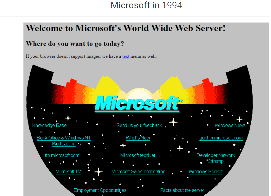
Image Source: Web Design Museum
So I was too young to be shown this obscenity (sorry Microsoft – but I am right now offended looking at this).
Earth to Microsoft – I am not sure what design galaxy you were lost in or inspired by – but why Microsoft? Why did you publish this?
Style guide – nope. Typography, what is that?
Colour palette? No thank you and no one cared.
Hence, you get the above results.
I don’t think the words “mood board” were in the dictionary of the good folks that let this go live.
That’s okay. Websites at that time were mostly an IT project that no one in marketing or even design knew or cared about. It was all TV back then.
It really was not a selling tool the way it has become over the last 20 years.
Hmm, maybe it was just too ahead of its time (hence the space reference in design) – because in 2022, “anti-design” is in. That means no branding, mixed fonts, and no consistency.
I have digressed too far.
Okay now, let’s take it into the 21st century quickly.
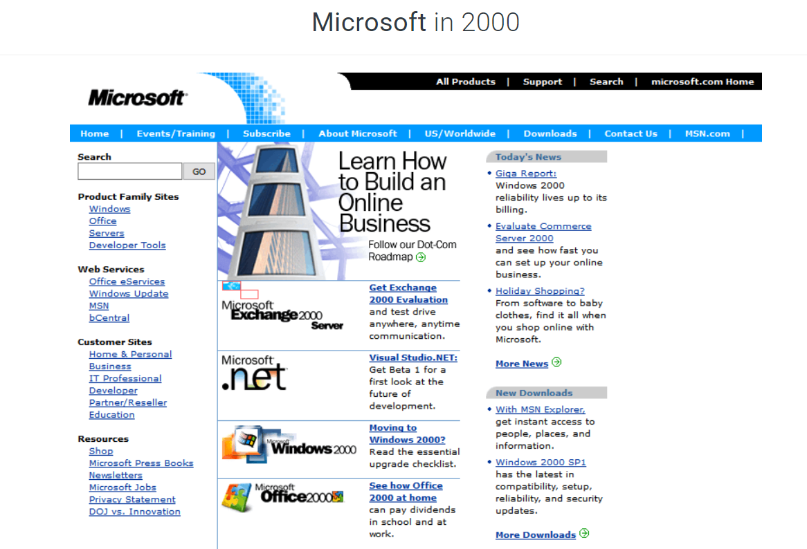
Image Source: Web Design Museum
Yikes – still feels like a directory but way better than the weird galaxy thing from 1994.
Let’s fast forward another 10 years. 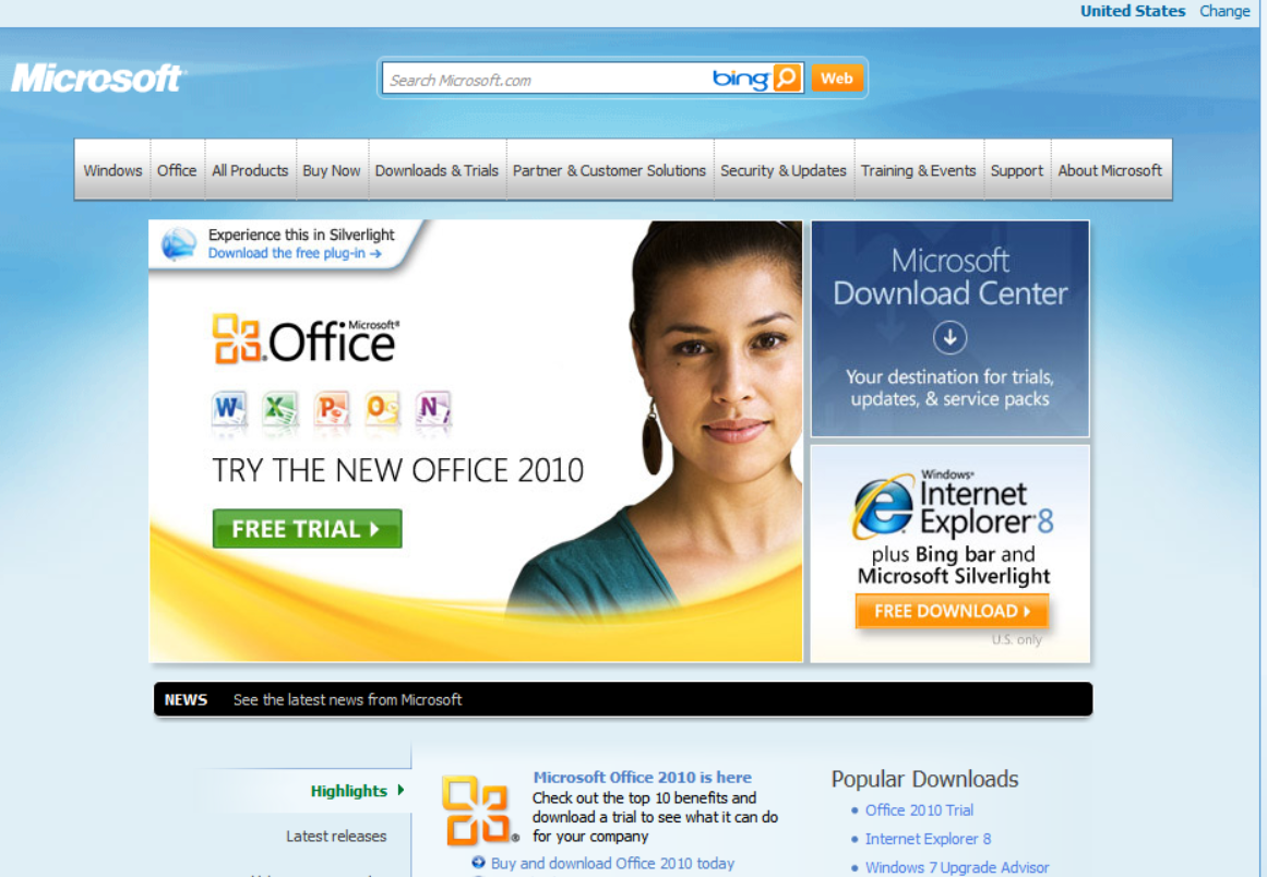
Image Source: Web Design Museum
Okay, now it’s getting more in line with what we are used to seeing. Still too “brochury” for my taste, but definitely a big leap in design and navigation here.
The typography is more on point, but still too busy at places.
The hero header is being interrupted by other multiple call-to-actions.
There is not enough spacing and breathing room and still gives a “clutter” feel no?
No concept of minimalism here. Pack as much as possible in as little space was the name of the game in this era.
Let’s move on – we are now in the 2020s:
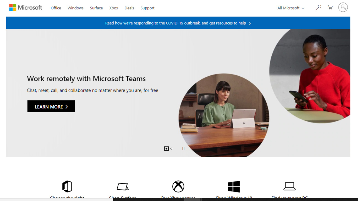
Image Source: Web Design Museum
Ahh – I am not screaming in my head anymore.
So much simpler in design than before. More breathing room we are used to seeing.
The spacing, and a clear focus on what action they want the user to take.
There is a good use of icons with a great call to actions right below the hero header that use the logos that the world is familiar with to give direct access to those services or product offerings – very good use of branding and sub-brands iconography.
The photography with the product is a nice touch, but it still speaks and gives the feel of “B2B” more with this look than actually “B2C”.
I mean, isn’t the design showing consumers but the use of circles is getting in the way of showing enough of the way the consumer uses it in their natural state.
In 2022, we have gotten away from that.
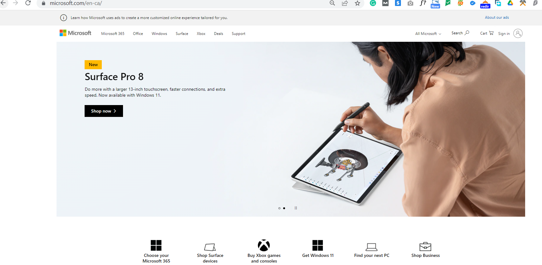
This is the hero header that slides into view that I see.
Isn’t the photography more impactful?
Clear call to action, with a stunning photograph with the consumer using it in their natural setting. That’s what I am talking about.
And this photo speaks more B2C than the display used in 2020.
2 years made a big difference and I think they are more on point.
Microsoft should update their website
Even with the facelift from 2 years ago, the site is now behind trend from where it needs to be a ‘cool’ tech company.
We don’t have any of these design trends being used:
- Oversized footers
- Larger typography
- Warmer and limited colour palettes fuzion if not in their branding, then in their choice of photography
I am sure the design and marketing team at Microsoft is well aware and is already working to release their next phase of design to stay on trend in the next few months.
Does Your Website Looking Retro But Unintentionally?
If you have a brand and a website that is dated over 4 years, please ask us for help.
We will do what we can to help you at least give a facelift to that old dog.
Good people deserve great help. Even minor changes with the right choice of photography can help salvage an existing site without much investment.
Until next time, happy designing!